The technologies I used were very useful and reliable tools.
I am already experienced with Photoshop and therefore enjoyed using this one the most. I found all the photo editing & creating simple page layout design very easy. I was able to help other students that were not as 'Photoshop-savvy' as I was. However due to my over confidence it meant that I tried to make something unusual that would be more interesting than the rest of the class, however this resulted me in loosing some of the main points that I needed to have. I think that if there was a technology similar to this & that was a bit more confined and did not allow you to be as creative and free that would be useful.
Illustrator was also very similar. Creating mast heads was simple and easy, however we did only touch on how to use it. I think that they would have been just as easily made in Photoshop, or any other software, but the fact that illustrator works in vectors makes everything a lot easier to use and you do not need to worry about not creating a large enough document.
The technologies I used to write my analysis were very basic (for me) except for AE (After Effects Cs5.1) which used to make the YouTube video. I had to learn to key frame & also learn how to time the wiggler effect with the music, which is not even that noticeable during a first glance, also the work that went into making it as attractive as I could, could not compete with the premade templates from PowerPoint, prezi & emaze.
From this project I have learnt how to use the photography studio in a lot more detail which is also useful for my photography class. Not only this but I have learnt a lot about how magazines are put together. It has helped me to appreciate magazines and helped me to understand the struggles of getting the photo's, editing them, and making the magazine work properly.
I have learnt that functionality is more useful than making something unique and artsy.
I have also learnt that music magazines are a lot more lenient with what they include in comparison to a regular newspaper. It seems to be a lot more relaxed.
If I was given the chance it would have been nice to create a web design so that I could show how technology has affected magazines, and create an online article. I feel that this may be useful and more prominent for magazine designers in the future with the constant development of technology & the internet, however I would have to learn how to use Adobe Fireworks & Dreamweaver, which I have no idea how to use except for the basic knowledge that it is complex and different to most adobe software.
Wednesday, 3 February 2016


Friday, 29 January 2016

Wednesday, 13 January 2016
Monday, 11 January 2016
Wednesday, 9 December 2015


Tuesday, 1 December 2015

The house style is a red masthead located at the top of the page on each front cover of the magazine and I use page numbers are the bottom corners (furthest from the centre) of each page, there is also a barcode & the other main things needed for a magazine.
The cover lines are located either side of the model as it will not cover him up & lose emphasis on the image and the editing to the photography. The model is also looking into the camera, and his eyes are the brightest thing on the page after the text.
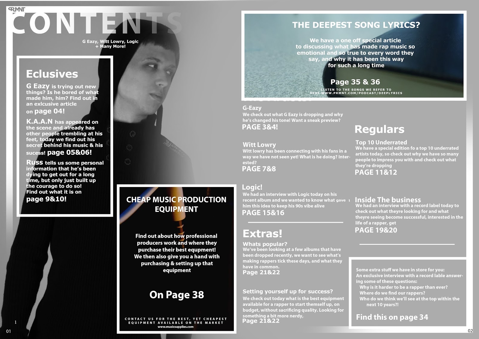
My contents page has faded lines in each corner to indicate that it is the contents page, this would be the same for each of my magazines, and is a main component to my house style. The contents page will always be in black and white minus a few photos 'in front' of the model as this draws emphasis to them, I would use these areas to advertise special articles and 'one offs'
The double page spread use minimal images and has one model in the background, as the article is very much so textually based, and should not orientate around a photograph. However I have used anchorage as the two previous photo's have been quite serious & I have not made the model to look as energetic previously. In this image there is a change, as the article is about change. People would be shocked to see my model like this if they had any prior knowledge to his personality & this is my reasoning for making the model (representing G-Eazy) behave so unusually.

Subscribe to:
Comments (Atom)