Timeline

Monday 28 September 2015

Article Analysis

The article has a large header text and is very bold and fills the space provided. it is very prominent on the page. The rest of the text is not as bold but is effective in taking up the space. There is a medium sized quote located in the centre of the page which gives you an idea of what the article is orientated around as well as the header itself. The layout is very professional but it means that it is easy to read. There is a very symmetrical feel about this article.
 

The next article uses images a lot too. This seems to be a recurring theme through all the magazines that i have looked at. I think that the text was rather small but the same could be said abotu their cover page. I think that this is just their house style and it used to make the magazine seem more upper class than it actually is and have people be proud to read it. Large texts can be associated with children's books, so small text must do the opposite.

The header text is not noticeable as it is in brackets, but it is still larger than the rest of the articles text so you can tell that it still is technically the header text.

Contents Pages


The NME's contents page contains lots of images and different elements which as a quick glance would make the magazine more exciting. They have promotional offers on brighter areas also which draws attention to them. The text is all roughly the same size however the more important information is in a slightly more quirky font & is usually capitalised. 

The language used makes the magazine seem more fun and laid back, which is what their target audience want, unlike a newspaper which required proper english and no profanity. However the piece of information centred in the page says 'Pete Doberty said to me, You're fucked , you need to go to bed' which is quite possibly the least professional quote they could have used. 

Similarly for XXL they used the use of images to attract the readers attention. This particular contents page is a small list of text alongside another picture of the supposed person on the cover of the magazine.
The header text is in a modern font which is very true to the audience, they like things to be new and fresh, however the rest of the text is very swirly and calligraphic which is still appealing but looks more like a restaurant menu rather than a magazines contents page. I repeat, it is still attractive. The text is more professional and do not allow profanity, the quotes are more interesting than the NME's however are not as large so you are not likely to read them as you are to read the NME's. 


Learning Photoshop

We were working with photoshop today. However I have been doing this for roughly three years so photoshop is no issue for me.


I was able to get a large picture of my desired 'model' (G-Eazy) and fit him in the bottom right are of the screen, but let him take up most of the page. I then found a font with multiple thickness options and used three of them; Regular, Bold & Italic. I did not use simple black or white for the background, more a light grey backing & dark grey text, this made it look more professional, as this is the style that G-Eazy likes to work with. With the cover lines I changed used an adjustment layer by selecting the outline of the text & then creating a new adjustment layer (invert) as this meant that if it goes over onto the model that it will still be visible as it will be the opposite colour to anything behind it. I realised that the image was lacking something so I got a smoke stock from the internet rubbed out around the model with a soft brush and placed the smoke behind him, leaving a small amount on either side of him. I then applied a white brush at the top right corner on top of everything to give an element of light to the image. I used sizing to my advantage, have the main points of interest large, and having extra information small or unnoticeable to keep the minimalist qualities of the cover page.


The photo had some dimples on his face which ruined the picture of the model. I used a spot healing brush to fix this, and now it is pretty much unnoticeable that there was ever an indent in his face, I was particularly proud of this, as it is not always easy to fix parts of the image like this. 

Tuesday 22 September 2015

Media Kits

Through looking at media packs (supplied by the GCP) I have realised that the statistics supplied are very useful for advertisers to decide on what magazine they wish to put their magazine in.

For example the NME is very blunt with telling the possible advertiser what they may be purchasing advertising space for. They may give obvious information, but however the most obvious information is also the most useful information. They leave reviews so they can see the response from people that have previously used their work. This suggests to the possible buyer that the advertising that goes into these magazines is effective.

The stats are very average and could be expected for a pop magazine. However it keeps to the musicians of their childhood as well as the modern musicians, giving a best of both worlds, giving quite a broad range of people to advertise to.


----
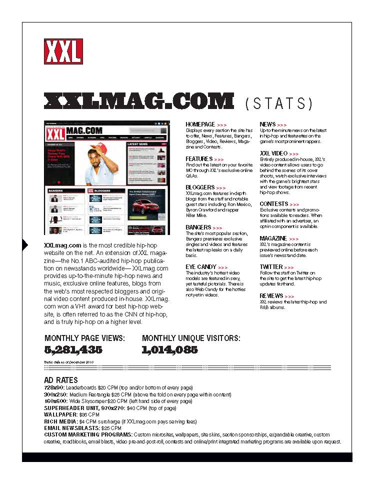
My second media pack is for XXL magazine. It shows similar characteristics, except has a different music genre, so the type of product may be different. The magazine is aware that their audience is very into rap.

They have gone in detail enough to show how much money the average reader has, which is very useful as it means they can decide if their product is in the price range of the products target audience.

They give a lot of statistics about not only the magazine but other places where advertising is available, including social media & their website articles.  they also show how they beat their competetors in advertising and how their magazine is more popular.


Wednesday 16 September 2015

AS Media [Spencer Reid] [Adobe InDesign]

Wed 16th Sept. - Intro.

-   Hello! This is just a small section so that you can understand what this blog is about. This is my recollection of my AS Media course as my first year as a college student, you will be able to see me use software such as InDesign & Photoshop, as well as looking at other technical things to do with media as a whole and how it is done professionally. I will already know most of the things to do with Photoshop as I have been working with it for 2 years, [ http://mvdzn.carbonmade.com , if you don't believe me, that link is a portfolio of my work]
The piece of work attached to this is the work from the induction course which was to produce a layout for a double page spread for an article. Which i have completed. Here is a layout and a finished article.

.

.
Don't expect too much writing, I went a bit overboard with this.
-
I hope you enjoy viewing my work!
-
Thanks. c;