The technologies I used were very useful and reliable tools.
I am already experienced with Photoshop and therefore enjoyed using this one the most. I found all the photo editing & creating simple page layout design very easy. I was able to help other students that were not as 'Photoshop-savvy' as I was. However due to my over confidence it meant that I tried to make something unusual that would be more interesting than the rest of the class, however this resulted me in loosing some of the main points that I needed to have. I think that if there was a technology similar to this & that was a bit more confined and did not allow you to be as creative and free that would be useful.
Illustrator was also very similar. Creating mast heads was simple and easy, however we did only touch on how to use it. I think that they would have been just as easily made in Photoshop, or any other software, but the fact that illustrator works in vectors makes everything a lot easier to use and you do not need to worry about not creating a large enough document.
The technologies I used to write my analysis were very basic (for me) except for AE (After Effects Cs5.1) which used to make the YouTube video. I had to learn to key frame & also learn how to time the wiggler effect with the music, which is not even that noticeable during a first glance, also the work that went into making it as attractive as I could, could not compete with the premade templates from PowerPoint, prezi & emaze.
From this project I have learnt how to use the photography studio in a lot more detail which is also useful for my photography class. Not only this but I have learnt a lot about how magazines are put together. It has helped me to appreciate magazines and helped me to understand the struggles of getting the photo's, editing them, and making the magazine work properly.
I have learnt that functionality is more useful than making something unique and artsy.
I have also learnt that music magazines are a lot more lenient with what they include in comparison to a regular newspaper. It seems to be a lot more relaxed.
If I was given the chance it would have been nice to create a web design so that I could show how technology has affected magazines, and create an online article. I feel that this may be useful and more prominent for magazine designers in the future with the constant development of technology & the internet, however I would have to learn how to use Adobe Fireworks & Dreamweaver, which I have no idea how to use except for the basic knowledge that it is complex and different to most adobe software.
Wednesday, 3 February 2016


Friday, 29 January 2016

Wednesday, 13 January 2016
Monday, 11 January 2016
Wednesday, 9 December 2015




Tuesday, 1 December 2015

The house style is a red masthead located at the top of the page on each front cover of the magazine and I use page numbers are the bottom corners (furthest from the centre) of each page, there is also a barcode & the other main things needed for a magazine.
The cover lines are located either side of the model as it will not cover him up & lose emphasis on the image and the editing to the photography. The model is also looking into the camera, and his eyes are the brightest thing on the page after the text.
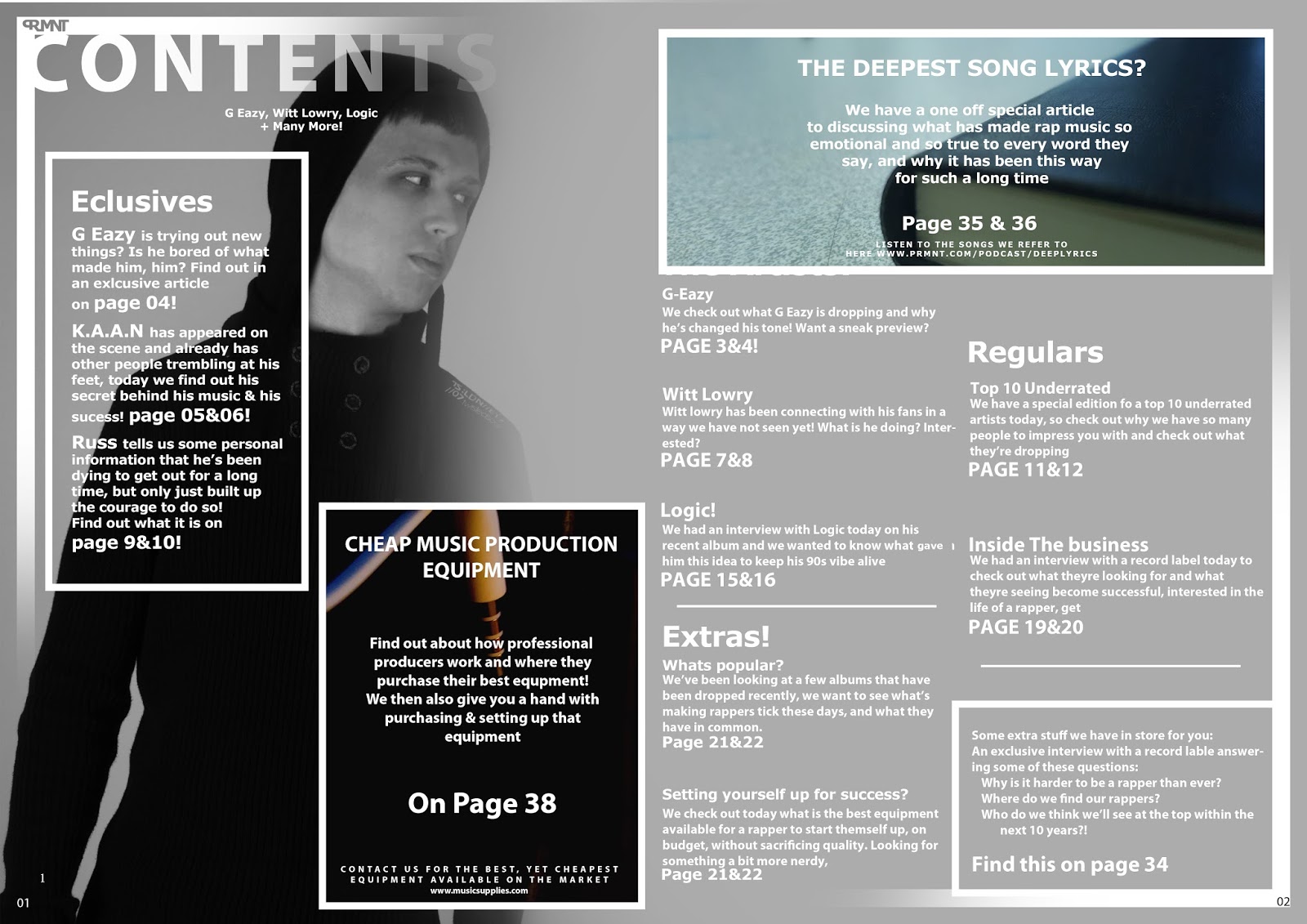
My contents page has faded lines in each corner to indicate that it is the contents page, this would be the same for each of my magazines, and is a main component to my house style. The contents page will always be in black and white minus a few photos 'in front' of the model as this draws emphasis to them, I would use these areas to advertise special articles and 'one offs'
The double page spread use minimal images and has one model in the background, as the article is very much so textually based, and should not orientate around a photograph. However I have used anchorage as the two previous photo's have been quite serious & I have not made the model to look as energetic previously. In this image there is a change, as the article is about change. People would be shocked to see my model like this if they had any prior knowledge to his personality & this is my reasoning for making the model (representing G-Eazy) behave so unusually.

Monday, 30 November 2015
Almsot finished
This is what I have at this current moment, I have the elements of the article together, it is just a matter of combining them.
I think that it would have been nicer if i had made the cover page have reached the edges of the page instead of having it separated.
I also think that the contents page could have had some more sections for me to write about
I liked the sizing on the cover page as it used size, touch ups, and cover lines well.


Here is the before and after of the touching up i did for my model. I changed the saturation on the image for my house style as well as removed sports & other imperfections on my models face.


I think that it would have been nicer if i had made the cover page have reached the edges of the page instead of having it separated.
I also think that the contents page could have had some more sections for me to write about
I liked the sizing on the cover page as it used size, touch ups, and cover lines well.


Here is the before and after of the touching up i did for my model. I changed the saturation on the image for my house style as well as removed sports & other imperfections on my models face.


Tuesday, 17 November 2015
Design Of Cover Page
I ahev started the design of the cover page so that I can be prepared to simply add the images after the photoshoot takes place. I can not make any more progress until my model has done all the things they need to do in preperation to take the photo's at this time. So i am doing all i can do for now.


Monday, 16 November 2015
Design & Call Sheet


Current design layout for my contents & cover page. The double page spread is yet to be made.
There is some information written in the design about how i want it to look.
The call sheet is almost completed. I need to fill in a small amount of information. Such as the time that i wish to complete my magazine.

Friday, 6 November 2015
PRMNT Magazine Proposal
This is my proposal to the magazine itself. I was given some feedback, and people asked questions about my magazine.
(Sorry for the video being cut short, I was not editing the video, as it was all one long clip)
I was told that I should think more about specific things that I want to happen in my magazine. I have thought about running regular Q&A's, and also spotlight pages for a 'who to watch' area. This would suite my audience as they are quite adventurous, and would like to find upcoming stars.
They also told me that I should think if greyscale images is the best idea, it was simply a question. I have come to conclusion that this will work, the whole page will not be black & white, there will be colour on some of the text, and also part of my house style is going to be strips of colour around the edges of the pages.
(Sorry for the video being cut short, I was not editing the video, as it was all one long clip)
I was told that I should think more about specific things that I want to happen in my magazine. I have thought about running regular Q&A's, and also spotlight pages for a 'who to watch' area. This would suite my audience as they are quite adventurous, and would like to find upcoming stars.
They also told me that I should think if greyscale images is the best idea, it was simply a question. I have come to conclusion that this will work, the whole page will not be black & white, there will be colour on some of the text, and also part of my house style is going to be strips of colour around the edges of the pages.
Tuesday, 3 November 2015
London Bridge
My cover star is likely to fit the persona of one of two people, depending on which model I can get in for my photo-shoot. I would prefer to get someone that is likely to fit the persona of 'G-Eazy' however I do not think that this is going to be viable as his clothing choice is very unique and would cost a lot to buy in just for my photo-shoot.
Whereas my other possible persona is more a casual stereotypical American as he is trying to not seem out of the ordinary, and relatable, so he should be easy to replicate. He wears normal clothes and is called Witt Lowry.
Whereas my other possible persona is more a casual stereotypical American as he is trying to not seem out of the ordinary, and relatable, so he should be easy to replicate. He wears normal clothes and is called Witt Lowry.
Monday, 2 November 2015
PRMNT
Here are the general ideas for my proposal which i will be presenting to the class;
It will be titled PRMNT. Which stands for the word Prominent. Prominent is also another word for famous or important.
This would suite my audience as the people i will be targeting listen to underrated rappers. They will be looking for those people that are 'almost on' so the name PRMNT is quite ironic, but the audience will understand this.
Friday, 16 October 2015
Mast Head Ideas (Design Wise)
To make my mast head i will use vibrant colours, preferably colour schemes that people are already aware of as people are more likely to look at things that they have seen before.
The font used should be bold and with minimal horizontal spacing, as this makes it feel as if it doesn't take up much space, but at the same time is still large on the page.
However some more unusual things could be done such as using a thin font, it would be less suitable for a mast head but it is still worth experimenting with
Here are a few things we made in class.


The top one ticks all the boxes, except the colour is too calming and does not really catch your attention. The second one also has similar qualities, but has a unique feel, it does not really fit the purpose either
The last one has some text manipulation and has more suitable colours, i think i will use this for my magazine.

The font used should be bold and with minimal horizontal spacing, as this makes it feel as if it doesn't take up much space, but at the same time is still large on the page.
However some more unusual things could be done such as using a thin font, it would be less suitable for a mast head but it is still worth experimenting with
Here are a few things we made in class.


The top one ticks all the boxes, except the colour is too calming and does not really catch your attention. The second one also has similar qualities, but has a unique feel, it does not really fit the purpose either
The last one has some text manipulation and has more suitable colours, i think i will use this for my magazine.

Wednesday, 14 October 2015
Possible Magazine Content
I would like to get aspiring rappers who are not very big right now, but looks as if they have potential, or better yet are growing rapidly but have not quite made it. I already have a couple of candidates in line for this:
People such as Witt Lowry, or Ivan B.
However people that are well known that will draw them into the magazine would be rappers such as G-Eazy, Logic and Hoodie Allen.
As I will find it hard to get an actual interview with these rappers I will have to use media that hey have already put out to make my articles, this may be things such as lifestyle, clothing, or just about what they have planned to come up. However if they have not put out much information, or they are the main article, I will have to put out information about all 3 in one article.
-
Something that could happen regularly in my magazine could be a spotlight for the weeks best underrated rapper. This would not only help smaller rappers get noticed but also give people a chance to find new music. It also means that you do not need to get permission from the rapper & you do not need to try to convince them to give you an interview. There are already lots of you-tube channels such as 'SwagyTracks' (which I hate the name of) dedicated to this sort of thing so it would be easy to find someone each week.
I would name this section; 'Nearly On'.
People such as Witt Lowry, or Ivan B.
However people that are well known that will draw them into the magazine would be rappers such as G-Eazy, Logic and Hoodie Allen.
As I will find it hard to get an actual interview with these rappers I will have to use media that hey have already put out to make my articles, this may be things such as lifestyle, clothing, or just about what they have planned to come up. However if they have not put out much information, or they are the main article, I will have to put out information about all 3 in one article.
-
Something that could happen regularly in my magazine could be a spotlight for the weeks best underrated rapper. This would not only help smaller rappers get noticed but also give people a chance to find new music. It also means that you do not need to get permission from the rapper & you do not need to try to convince them to give you an interview. There are already lots of you-tube channels such as 'SwagyTracks' (which I hate the name of) dedicated to this sort of thing so it would be easy to find someone each week.
I would name this section; 'Nearly On'.
Tuesday, 13 October 2015
Target Audience
My target audience is going to have a quite a large range of ages. It will be able to range from 16 - 28. I have done this as rap music and other popular music of similar styles is quite popular with a large age group, as it can fill older people with nostalgia and also younger people with their favourite current music. I have not only picked this type of magazine as it is my favourite music choice, but also because it will fit into the age group that is most likely to buy a magazine (Aged 27 on average).
My target audience will most likely be people in the 'aspirer' category as they care very much about their appearance to others. However they usually are not pushed away from spending a bit more money, than the typical mainstream category. So my target audience may also fall into the Succeeder category. It can cover a wide area, which is good in some aspects but advertisers would find it hard to target the audience very easily.
My target audience will be predominantly male, as the other magazines i have looked at have also had a higher percentage of male readers over female readers. (XXL had more than 60% of their readers as male, from the media kit that i looked at)
My readers will fall mainly around the B, C1 and C2 group as they are not extremely rich but still like to spend a lot of money on luxuries if they can. However there may be a percentage of D as well as they are not all as rich as the rest. There will not be many uneducated people that read my magazine as they will not be educated enough to actually enjoy reading it at all, or wish to spend money on buying a magazine.
My target audience will most likely be people in the 'aspirer' category as they care very much about their appearance to others. However they usually are not pushed away from spending a bit more money, than the typical mainstream category. So my target audience may also fall into the Succeeder category. It can cover a wide area, which is good in some aspects but advertisers would find it hard to target the audience very easily.
My target audience will be predominantly male, as the other magazines i have looked at have also had a higher percentage of male readers over female readers. (XXL had more than 60% of their readers as male, from the media kit that i looked at)
My readers will fall mainly around the B, C1 and C2 group as they are not extremely rich but still like to spend a lot of money on luxuries if they can. However there may be a percentage of D as well as they are not all as rich as the rest. There will not be many uneducated people that read my magazine as they will not be educated enough to actually enjoy reading it at all, or wish to spend money on buying a magazine.
Magazine Name
I have decided to call my music magazine:
- PRMNT
As it stands for prominent, a synonym of famous or important, just with a modern kick & a bit of interest to the word
The full capitals will mean that if it is mentioned in another magazine it will be very easily visible and, almost more visible on the page and would jump out on you. It is also similar to other well known magazines such as XXL. Which are also the same style of magazine that I am trying to produce. However my target audience is slightly different to XXL as i am not going for as 'hood' a style of music.
- PRMNT
As it stands for prominent, a synonym of famous or important, just with a modern kick & a bit of interest to the word
The full capitals will mean that if it is mentioned in another magazine it will be very easily visible and, almost more visible on the page and would jump out on you. It is also similar to other well known magazines such as XXL. Which are also the same style of magazine that I am trying to produce. However my target audience is slightly different to XXL as i am not going for as 'hood' a style of music.
Tuesday, 6 October 2015
Contents & Cover

I designed a small logo for branding and so that i could have a more clear house style. It is located in the bottom right of each page, and very small.
I think that the cover page could have had a better image that is slightly more suitable for a college magazine as the books in my hand are not quite enough to make it obvious of the subject matter.
 I found it hard to make the text readable on the cover page as the image itself was quite a neutral grey and either colour i put over the top of this would have made it hard to read. The blurred invert did not work quite as well as i had hoped, but if you are trying to read it you can still read it.
Other people liked the layout and said that they thought that it looked professional. They also liked the effects that I used, my making images greyscale & overlaying a red shape to tint the image. They also liked the lack of text that was on the cover as it makes it look east to read, they implied that it would make it more likely for someone to pick up.
Monday, 28 September 2015
Article Analysis
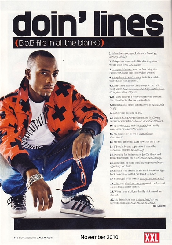
The article has a large header text and is very bold and fills the space provided. it is very prominent on the page. The rest of the text is not as bold but is effective in taking up the space. There is a medium sized quote located in the centre of the page which gives you an idea of what the article is orientated around as well as the header itself. The layout is very professional but it means that it is easy to read. There is a very symmetrical feel about this article.

The next article uses images a lot too. This seems to be a recurring theme through all the magazines that i have looked at. I think that the text was rather small but the same could be said abotu their cover page. I think that this is just their house style and it used to make the magazine seem more upper class than it actually is and have people be proud to read it. Large texts can be associated with children's books, so small text must do the opposite.
The header text is not noticeable as it is in brackets, but it is still larger than the rest of the articles text so you can tell that it still is technically the header text.

The next article uses images a lot too. This seems to be a recurring theme through all the magazines that i have looked at. I think that the text was rather small but the same could be said abotu their cover page. I think that this is just their house style and it used to make the magazine seem more upper class than it actually is and have people be proud to read it. Large texts can be associated with children's books, so small text must do the opposite.
The header text is not noticeable as it is in brackets, but it is still larger than the rest of the articles text so you can tell that it still is technically the header text.
Contents Pages
The NME's contents page contains lots of images and different elements which as a quick glance would make the magazine more exciting. They have promotional offers on brighter areas also which draws attention to them. The text is all roughly the same size however the more important information is in a slightly more quirky font & is usually capitalised.
The language used makes the magazine seem more fun and laid back, which is what their target audience want, unlike a newspaper which required proper english and no profanity. However the piece of information centred in the page says 'Pete Doberty said to me, You're fucked , you need to go to bed' which is quite possibly the least professional quote they could have used.

Similarly for XXL they used the use of images to attract the readers attention. This particular contents page is a small list of text alongside another picture of the supposed person on the cover of the magazine.
The header text is in a modern font which is very true to the audience, they like things to be new and fresh, however the rest of the text is very swirly and calligraphic which is still appealing but looks more like a restaurant menu rather than a magazines contents page. I repeat, it is still attractive. The text is more professional and do not allow profanity, the quotes are more interesting than the NME's however are not as large so you are not likely to read them as you are to read the NME's.
Subscribe to:
Posts (Atom)